mn_eco_industry <- clean_names(mn_eco_industry_raw) |>
  select(naics2017, naics2017_label, sector, estab, napcsdol) |>
  mutate(estab = as.numeric(estab)) |>
  filter(!is.na(estab)) |>
  mutate(napcsdol = as.numeric(napcsdol)) |>
  mutate(sector_label = case_when(
           sector == 44 ~ "Retail Trade",
           sector == 61 ~ "Educational Services",
           sector == 62 ~ "Health Care and Social Assistance",
           sector == 71 ~ "Arts, Entertainment and Recreation",
           sector == 72 ~ "Accommodation and Food Services",
           sector == 81 ~ "Personal and Laundry Services",
           TRUE ~ as.character(sector)
))Waffle
Intro
This section includes an application of the waffle package which is used to make waffle and pictograph charts in R. The pictograph portion was not working when I created this.
Variable Names for MN Economic Industry Dataset 2017
sector = NAICS economic sector estab = Number of establishments napcsdol = Sales, value of shipments, or revenue of NAPCS collection code ($1,000)
44 Retail Trade Educational Services Health Care and Social Assistance Arts, Entertainment and Recreation Accommodation and Food Services Personal and Laundry Services
Example Waffle Chart
example <- tibble(
  parts = factor(rep(month.abb[1:3], 3), levels=month.abb[1:3]),
  vals = c(10, 20, 30, 6, 14, 40, 30, 20, 10),
)

example |>
  count(parts, wt = vals) |>
  ggplot(
    aes(fill = parts, values = n)
  ) +
  geom_waffle(
    n_rows = 20,
    size = 0.33,
    colour = "white",
    flip = TRUE
  ) +
  scale_fill_manual(
    name = NULL,
    values = c("#a40000", "#169948", "#ae6056"),
    labels = c("Fruit", "Salad", "Pizza")
  ) +
  coord_equal() +
  theme_minimal()+
  theme_enhance_waffle()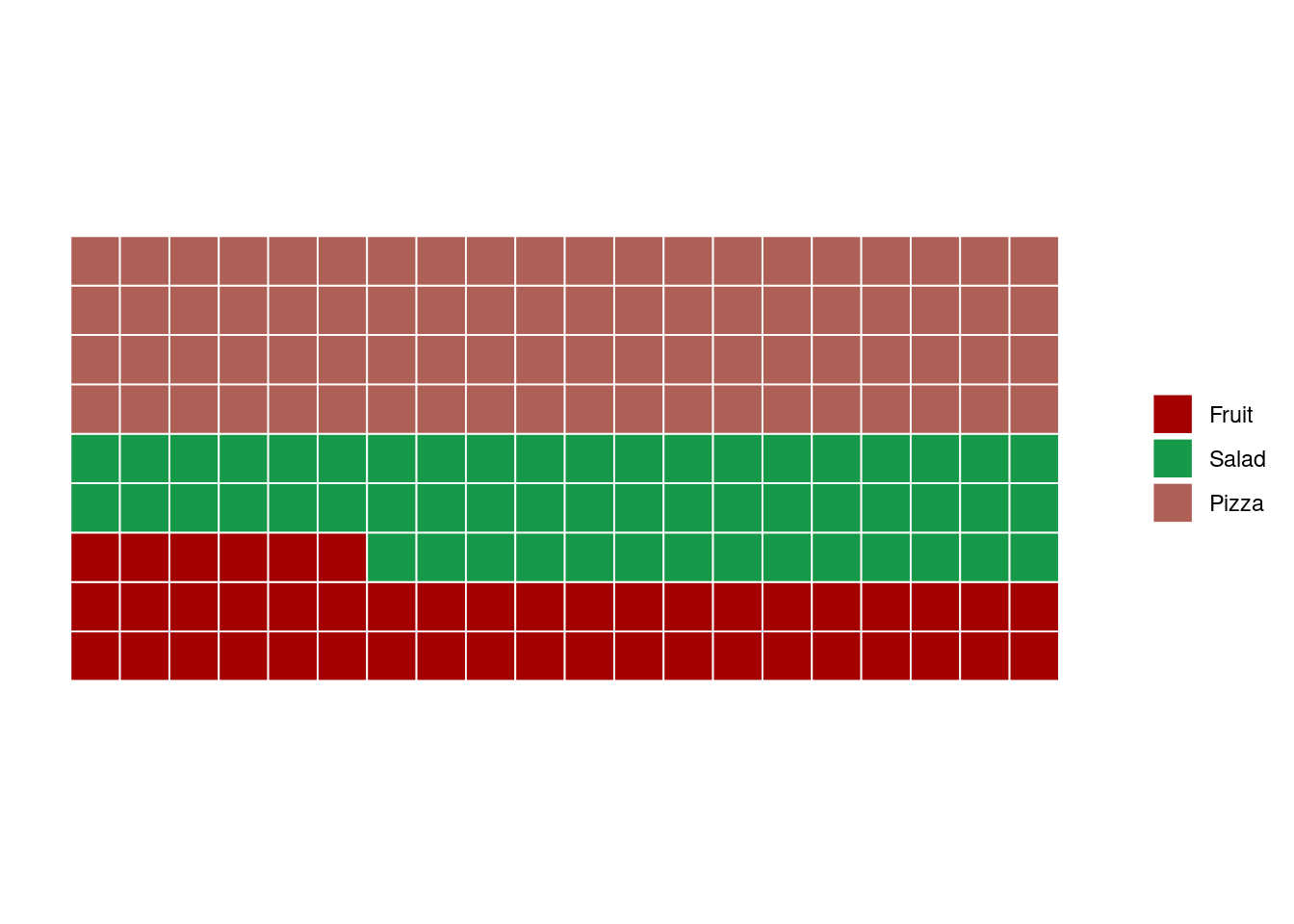
MN Economic Industry Sectors 2017
prop_eco <- mn_eco_industry |>
  group_by(sector_label) |>
  summarize(total = sum(estab)) |>
  mutate(prop = (total * 100 / sum(total)) + 0.35)

parts <- tibble(names = prop_eco$sector_label,
                vals = prop_eco$prop)

waffle(parts,
       rows = 10,
       size = 2,
       pad = 4,
       legend_pos = "bottom",
       title = "Minnesota Economic Industry Proportion by Sector")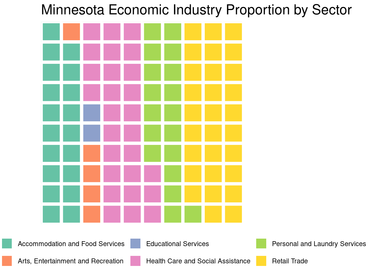
prop_eco |>
  ggplot(
    aes(fill = sector_label, values = prop)
  ) +
geom_waffle(
    n_rows = 10,
    size = 1.5,
    colour = "black",
    flip = FALSE,
  ) +
  scale_fill_manual(
    name = NULL,
    values = c("#0A9396", "#94D2BD", "#E9D8A6", "#EE9B00", "#CA7902", "#9B2226")
  ) +
  coord_equal() +
  labs(
    title = "Minnesota Economic Industry",
    subtitle = "Proportion of Establishments by Sector",
    caption = "Source: U.S. Census Bureau 2017"
  ) +
  dark_theme_minimal(base_size = 14)+
  theme_enhance_waffle()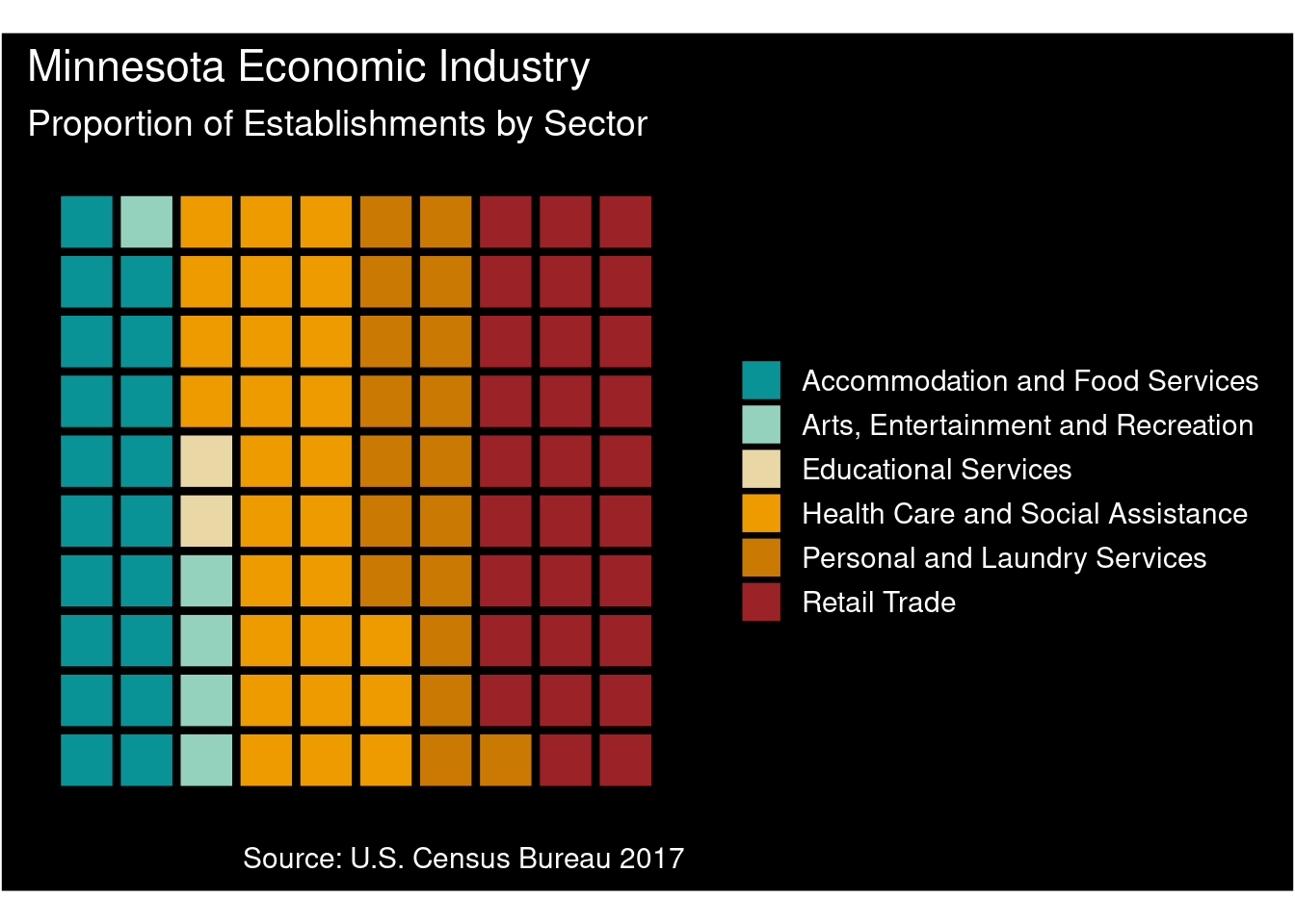
MN Economic Industry Retail Subsectors 2017
retail <- mn_eco_industry |>
  filter(sector_label == "Retail Trade") |>
  mutate(simplified_label = tolower(naics2017_label)) |>
  mutate(simplified_label = ifelse(grepl("stores", simplified_label), "Stores", simplified_label),
         simplified_label = ifelse(grepl("dealers", simplified_label), "Dealers", simplified_label),
         simplified_label = ifelse(grepl("markets", simplified_label), "Markets", simplified_label),
         simplified_label = ifelse(grepl("retailers", simplified_label), "Retailers", simplified_label),
         simplified_label = ifelse(grepl("stations", simplified_label), "Stations", simplified_label),
         simplified_label = ifelse(grepl("establishments", simplified_label), "Establishments", simplified_label),
         simplified_label = ifelse(grepl("houses", simplified_label), "Houses", simplified_label),
         simplified_label = ifelse(grepl("centers", simplified_label), "Centers", simplified_label),
         simplified_label = ifelse(grepl("operators", simplified_label), "Operators", simplified_label),
         simplified_label = ifelse(grepl("retail trade", simplified_label), "Retailers", simplified_label),
         simplified_label = ifelse(grepl("florists", simplified_label), "Stores", simplified_label)) |>
  group_by(simplified_label) |>
  summarize(total = sum(napcsdol)) |>
  mutate(prop = (total * 100 / sum(total)) + 0.35)
retail |>
ggplot(
aes(fill = simplified_label, values = prop)
) +
geom_waffle(
n_rows = 10,
size = 1.5,
colour = "black",
flip = FALSE,
) +
scale_fill_manual(
name = NULL,
values = c("#0A9396", "#94D2BD", "#E9D8A6", "#EE9B00", "#CA7902", "#9B2226")
) +
coord_equal() +
labs(
title = "Minnesota Retail Economic Sales",
subtitle = "Proportion of Sales by Sub Sector",
caption = "Source: U.S. Census Bureau 2017"
) +
dark_theme_minimal(base_size = 14)+
theme_enhance_waffle()
retail_rm <- retail |>
  filter(simplified_label != "Markets") |>
  filter(simplified_label != "Operators") |>
  filter(simplified_label != "Establishments")

prop_eco_napcsdol <- mn_eco_industry |>
  group_by(sector_label) |>
  summarize(total = sum(napcsdol)) |>
  mutate(prop = (total * 100 / sum(total)) + 0.35)

full_parts <- tibble(names = prop_eco_napcsdol$sector_label, vals = prop_eco_napcsdol$prop)
Iron Function
The iron function is used to combine 2 or more waffle charts without using a facet.
retail_parts <- tibble(names = retail_rm$simplified_label, vals = retail_rm$prop)

full_parts <- tibble(names = prop_eco_napcsdol$sector_label, vals = prop_eco_napcsdol$prop)

w1 <- waffle(full_parts,
       rows = 10,
       size = 2,
       pad = 0,
       colors = c("#0A9396", "#94D2BD", "#E9D8A6", "#EE9B00", "#CA7902", "#9B2226"),
       legend_pos = "right",
       title = "Minnesota Economic Sales Proportion by Sector")

w2 <- waffle(retail_parts,
         rows = 10,
         size = 2,
         pad = 0,
         color = c("#461220", "#8c2f39", "#b23a48", "#fcb9b2", "#fed0bb", "#FFF1EB"),
         legend_pos = "right",
         title = "Retail Trade Economic Sales Proportion by Sub Sector")

iron(w1, w2)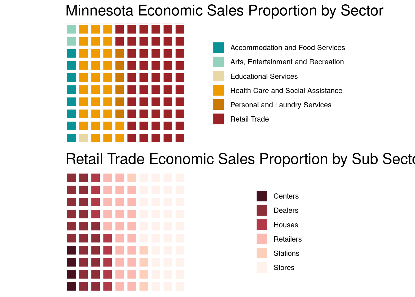
The waffle package is very useful in showing simple proportions. Other than that, it is not very useful for more complex data visualizations.