airbnb <- airbnb_raw |>
  filter(reviews > 10) |>
  filter(price < 300) |>
  filter(district %in% c("Southwest", "North", "Northwest", "Central")) |>

  mutate(district = case_when(
    district == "Southwest" ~ "SW",
    district == "North" ~ "N",
    district == "Northwest" ~ "NW",
    district == "Central" ~ "C"
  )) |>
  mutate(district = as.factor(district)) |>
select(price, bedrooms, accommodates, district)Simulation
Airbnb Data
We will be using the Airbnb dataset (from data collected by St. Olaf Students in 2016) to simulate prices based on the district in Chicago. We will be using the Central, Northwest, North, and Southwest districts since these districts have the highest amount of listings. We will be filtering out any listings with less than 10 reviews in order to remove any new listings that may not have accurate prices. We will also be filtering out any prices over $300 in order to level the playing field with all districts (the central district has considerably higher price extremes than the other districts).
Exploratory Data Analysis
The prices by bedrooms and accommodates show a positive correlation. However, there does not seem to be any relationship between district and either bedrooms or accommodates. We can see that prices are considerably higher in the Central district compared to the other districts. While the Southwest district has the lowest prices.
ggplot(airbnb, aes(x = price, y = bedrooms, color = district)) +
  geom_point() +
  labs(
    title = "Airbnb Prices by Bedrooms",
    x = "Price",
    y = "Bedrooms",
    color = "District"
  ) +
  dark_theme_gray(base_size = 12)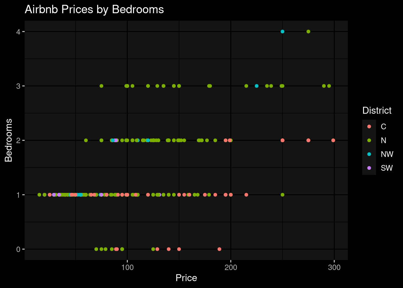
ggplot(airbnb, aes(x = price, y = accommodates, color = district)) +
  geom_point() +
  labs(
    title = "Airbnb Prices by Accommodates",
    x = "Price",
    y = "Accommodates",
    color = "District"
  ) +
  dark_theme_gray(base_size = 12)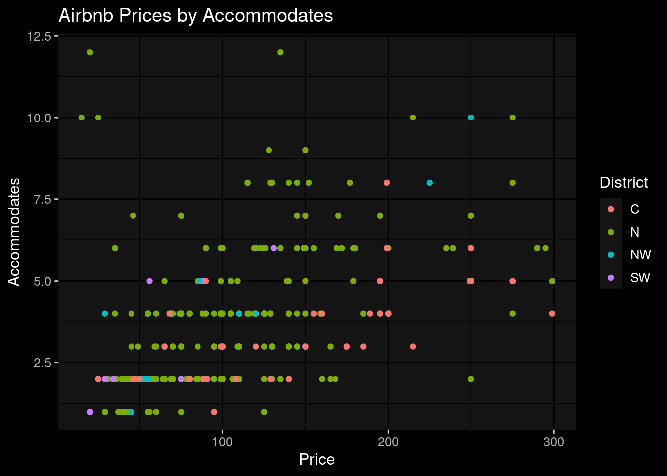
ggplot(airbnb, aes(x = district, y = price, fill = district)) +
  geom_boxplot() +
  labs(
    title = "Airbnb Prices by District",
    x = "District",
    y = "Price",
    fill = "District"
  ) +
  dark_theme_gray(base_size = 12)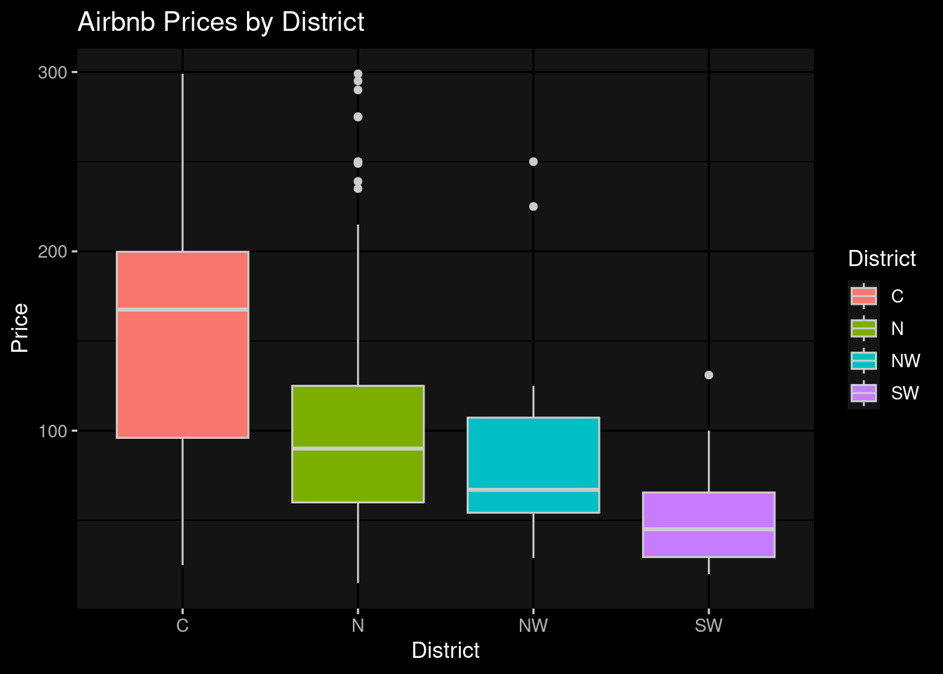
Generating Prices
This function generates prices based on the true mean and standard deviation. It also takes in the districts and the number of listings in each district. This function will be used later to simulate data for the Central, Northwest, North, and Southwest districts.
gen_prices <- function(true_mean, true_sd, districts, num_in_district, id = 1) {
  table <- tibble(
    district = factor(),
    price = numeric(),
    id = character()
  )

  for (i in 1:length(districts)) {
    sample <- rnorm(num_in_district$n[i], mean = true_mean, sd = true_sd)
    table <- bind_rows(table, tibble(district = rep(districts[i], num_in_district$n[i]), price = sample, id = rep(id, num_in_district$n[i])))
  }

  return(table)
}
Defining Parameters
price_mean <- mean(airbnb$price)
price_sd <- sd(airbnb$price)

num_in_district <- airbnb |>
  group_by(district) |>
  summarize(n = n())

mean_num_in_district <- mean(num_in_district$n)
Simulating Data
n_sims <- 8
params <- tibble(
  sd = c(rep(price_sd, n_sims)),
  id = c(paste("Sim", 1:n_sims))
)

simulation <- params %>%
  pmap_dfr(~ gen_prices(true_mean = price_mean, true_sd = ..1, districts = c("SW", "N", "NW", "C"), num_in_district = num_in_district, id = ..2))

airbnb_format <- airbnb |>
  mutate(id = "Truth") |>
  select(district, price, id)

final_sim <- rbind(simulation, airbnb_format)
We can determine from the simulated samples that there is a large difference from the total mean price of Airbnbs in the Chicago areas, specifically on Central and Southwest Chicago. For the North and Northwest regions, they appear to be consistent with the simulated box plots. The higher prices that we see with the central Airbnb’s could be related to its close proximity to downtown Chicago which would have a higher cost of living. Furthermore, Southwest Chicago might have fewer things to do and may not be as desirable for tourism. If we wanted to be sure of our findings, we could do a ANOVA statistical test.
ggplot(final_sim, aes(x = district, y = price, fill = district)) +
  geom_boxplot() +
  labs(
    title = "Simulated Prices by District",
    x = "District",
    y = "Price",
    fill = "District"
  ) +
  scale_y_continuous(limits = c(0, max(final_sim$price) + 100)) +
  dark_theme_gray(base_size = 12) +
facet_wrap(~id) 