poverty_data <- read_csv("https://jadenchant.github.io/data/poverty_estimates.csv")

poverty_data <- poverty_data |>
  filter(FIPS_code %% 1000 == 0 & FIPS_code != 0) |>
  mutate(state = str_squish(str_to_lower(as.character(area_name)))) |>
  mutate(state = gsub(" ", "", state)) |>
select(state, everything(), -state_code, -area_name)US States
The data is from the USDA’s Economic Research Service and is from 2021. Cleaning the data yields a dataset that can be joined by the us_states dataset. The us_states dataset is a dataset that contains the longitudes and latitudes of the states in the United States.
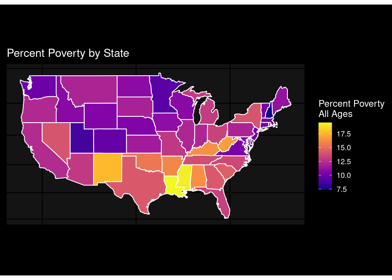
poverty_data |>
  right_join(us_states, by = c("state" = "region")) |>
  ggplot(mapping = aes(
    x = long, y = lat,
    group = group
  )) +
  geom_polygon(aes(fill = PCTPOVALL_2021), color = "#fefefe") +
  labs(fill = "Percent Poverty \nAll Ages") +
  labs(x = element_blank(), y = element_blank()) +
  ggtitle("Percent Poverty by State") +
  coord_map() +
  theme_void() +
  scale_fill_viridis(option = "C") +
  dark_theme_gray(base_size = 12) +
  theme(
    axis.ticks = element_blank(),
    axis.text = element_blank(),
    plot.margin = unit(c(2, 0, 2, 0), "cm")
  )
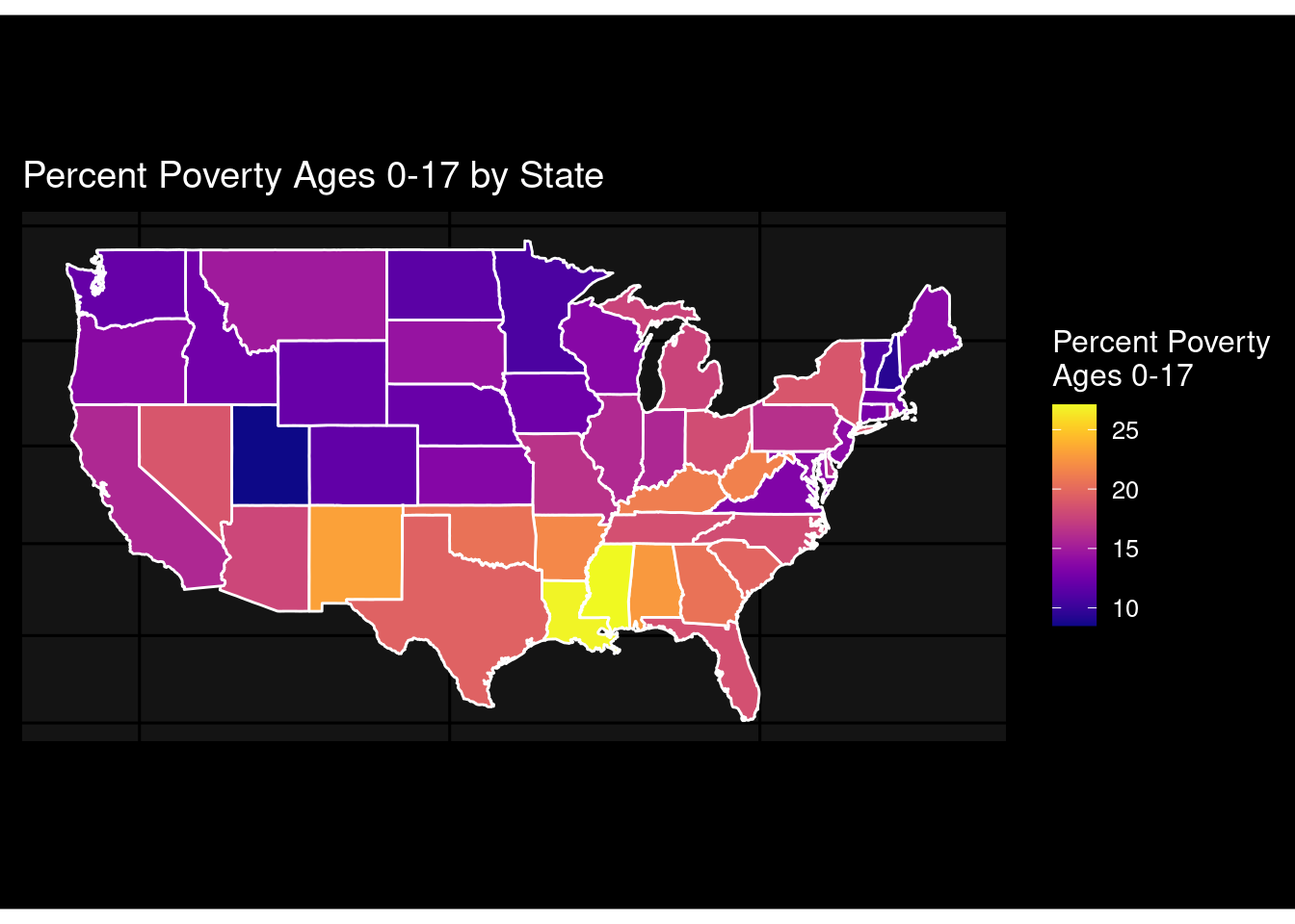
poverty_data |>
  right_join(us_states, by = c("state" = "region")) |>
  ggplot(mapping = aes(
    x = long, y = lat,
    group = group
  )) +
  geom_polygon(aes(fill = PCTPOV017_2021), color = "#fefefe") +
  labs(fill = "Percent Poverty \nAges 0-17") +
  labs(x = element_blank(), y = element_blank()) +
  ggtitle("Percent Poverty Ages 0-17 by State") +
  coord_map() +
  theme_void() +
  scale_fill_viridis(option = "C") +
  dark_theme_gray(base_size = 12) +
  theme(
    axis.ticks = element_blank(),
    axis.text = element_blank(),
    plot.margin = unit(c(2, 0, 2, 0), "cm")
  )
poverty_data |>
  right_join(us_states, by = c("state" = "region")) |>
  ggplot(mapping = aes(
    x = long, y = lat,
    group = group
  )) +
  geom_polygon(aes(fill = MEDHHINC_2021), color = "#fefefe") +
  labs(fill = "Estimated Median \nHousehold Income") +
  labs(x = element_blank(), y = element_blank()) +
  ggtitle("Estimated Median Household Income by State") +
  coord_map() +
  theme_void() +
  scale_fill_viridis(option = "D", direction = -1) +
  dark_theme_gray(base_size = 12) +
  theme(
    axis.ticks = element_blank(),
    axis.text = element_blank(),
    plot.margin = unit(c(2, 0, 2, 0), "cm")
  )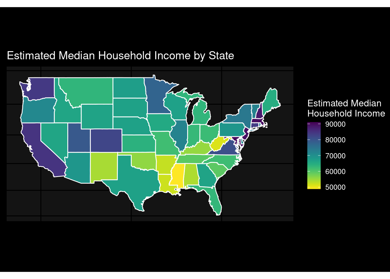
These maps show the percent poverty based on age by state level and show the estimated household income by state level. We can see the relationship between poverty and median household income. We also can see the relationship between region and poverty.